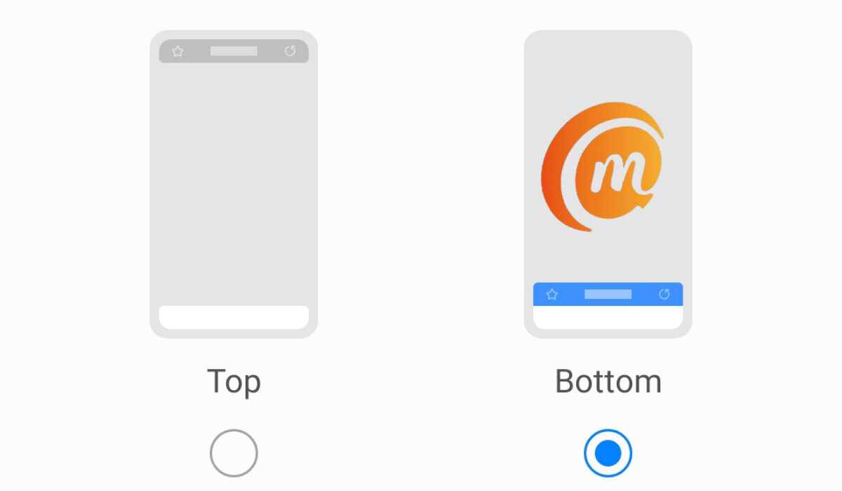
Many of the most common smartphones were initially designed with the flaw of having their address bar and menu at the top of the screen. It is such an inconvenience to have to reach up there each time, because our hands are usually firmly planted at the bottom to the middle of the phone. It is especially pronounced when you are using anything with a display bigger than 5 inches. It is my argument that mobile browsers should have their menu and/or address/search bar at the bottom, instead of having it at the top. Placing it at the bottom just makes for better usability. The traditional positioning at the top is a carryover from the days of desktop and laptop PCs. But mobile is different. The modern mobile browsers that were the first to get it 100% right included Microsoft’s Edge, the default Windows 10 Mobile browser and the BB10 browser. ALL user controls and interactions were at the bottom of the screen, and they were so refreshing to use. Sadly, these two browsers have since gone the way of the Dodo. The iPhone’s Safari browser got most of it right, but left the address bar and refresh button at the top of the screen. A similar arrangement is found on UCBrowser and Opera mini – the address bar, Speed Mode and refresh buttons are at the top of the screen while everything else is at the bottom. For some reason, on their Edge browser for Android, Microsoft left the address bar at the top of the page, while leaving the controls at the bottom. It works well, except for that tiny detail of having to reach for the top when I need to type in or edit a URL.
The best mobile Android browsers with URL bar at the bottom
2016 is a long time ago, and things have changed. Gradually, we are seeing the shift happen. Here are a few mobile browsers with URL bar at the bottom of the screen. In late 2021, Samsung’s mobile browser, Internet, got the feature as an option, letting users fix the URL bar at the bottom of the screen. Kudos to Samsung. Apple also joined the train in 2022 and have also moved the address bar in Safari to the bottom of the page. Safe to say that this movement is catching on like wild fire. Via mobile browser is another exemplary one that has everything – address bar, controls, and menu – all at the bottom of the page. Another mobile browser with the complete toolbar now located at the bottom is Mozilla Firefox. I am certain that someone reading this article is ready to yell, “What about Brave browser?!!” I wish I could list Brave browser as one of the best mobile browsers with URL bar at the bottom of the page. But it isn’t. Similar to what obtains with Microsoft Edge, the address bar is at the top, while the controls and menu are at the bottom. It works. Tap the Search icon on the toolbar at the bottom of the screen and you can type a URL to visit or a search phrase. So, it is close, and you might want to consider using Brave. I am comfortable using Microsoft Edge, after all.
Why is Chrome Mobile Browser lagging behind?
Google Chrome for Android once allowed users with technical knowledge to move the address bar from the top down to the bottom through the Flags menu. But that feature was removed down the road. Ideally, Chrome should have been at the forefront of this switch. I wonder what led to them backing out of it. However you look at it from the user’s perspective, mobile Web browsers with URL bar at the bottom make sense. We shall expect Chrome to capitulate soon too.
Don’t miss our reviews.Join our WhatsApp Group, to be notified of the most important articles and deals,Follow us on Instagram, Facebook, Twitter, and YouTube.

