Back in the day, 4:3 (1.33:1) was the standard aspect ratio for most movies. Then, in 2009, the 16:9 (1.77:1) widescreen aspect ratio took over in popularity and became the international standard for HD and UHD displays. And don’t forget the anamorphic 21:9 (2.35:1) ultra-widescreen aspect ratio, sometimes called CinemaScope, which came out in the 1950s and has ebbed and flowed in popularity over the years. These days, most movies are shot in 16:9 aspect ratio, with 4:3 generally delegated to art house films and 21:9 reserved for epic-scale productions. But who says you need to stick with only one aspect ratio for a film? Occasionally, movie directors have taken the bold initiative to use not one but two (or even three or four) different aspect ratios in a single movie. Here are some of the most iconic examples of this being done well.
10. Oz the Great and Powerful (2013)
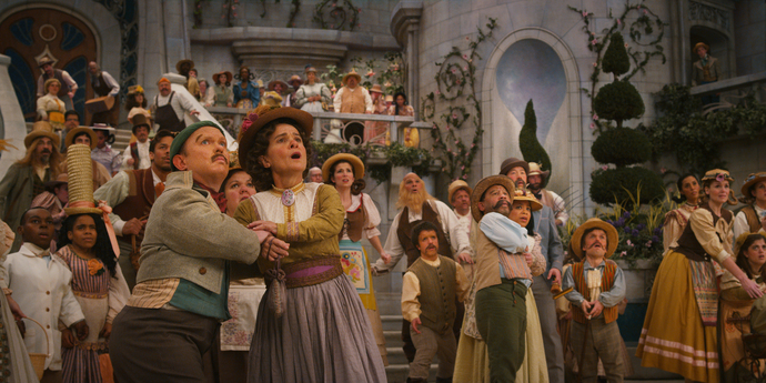
Oz the Great and Powerful harks back to the original The Wizard of Oz through its cinematography and aspect ratios. In Victor Fleming’s The Wizard of Oz, the color palette changes from sepia to Technicolor when Dorothy (Judy Garland) arrives in the glittering land of Oz. Similarly, when Oscar (James Franco) lands in the Emerald City, the black-and-white film shifts into full vibrant color. Along with the injection of color, director Sam Raimi extends from 4:3 to 16:9 widescreen, representing how Oscar’s whole world widens from the limitations of reality to the magical possibilities of Oz. Oscar remains a con artist in both worlds—1905 Kansas and the unmappable Land of Oz—but here, the witches and flying monkeys make his magic tricks that much more illustrious.
9. Boogie Nights (1997)
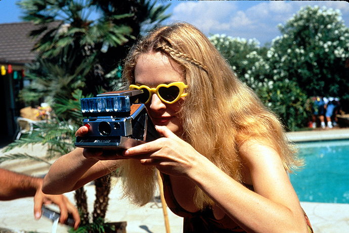
Using a square aspect ratio to evoke old home movies is a pretty standard technique in modern cinema—but what about to evoke a porn movie? Director Paul Thomas Anderson is a master of cinematic techniques, from dialogue structure to editing. In his semi-biographical comedy Boogie Nights (based on the real guy John Holmes), he uses grainy film footage to show his 70s star in action. The flickering footage and blurred frames echo that of 35mm film stock, distancing us from the reality of what’s happening. When we cut back to Dirk Diggler’s real life (played by Mark Wahlberg), it’s a more familiar 2.39:1. Outside of his 4:3 performances, Diggler has a glamorous lifestyle minus the glamour—drug overdoses, court battles, bankruptcy, and prostitution.
8. 500 Days of Summer (2009)
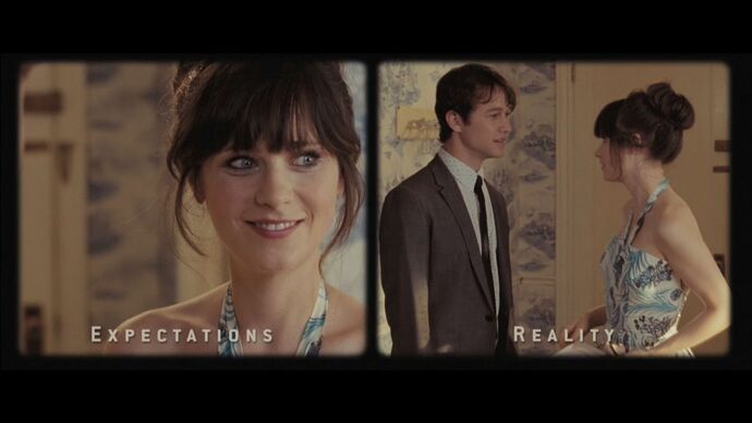
500 Days of Summer strikes a great balance between indie and mainstream, casting famous faces in a funny-and-occasionally-heartbreaking drama. Part of the reason why Marc Webb’s sleeper hit remains so beloved to this day is its willingness to stray from the usual path of romantic comedies—the protagonist doesn’t get the girl in the end—and it looks down on our tendency to romanticize memories and people. Although the plot errs on the side of realism, Webb keeps the visuals artsy and inventive. Not only do characters turn into drawings, but we even transition between seasons via animated calendar. Although the aspect ratio doesn’t move as much in 500 Days of Summer as it does in some of our other picks, we’re including it because the film’s most famous scene adopts two squares in a fun split-screen. The home movie-style footage depicts the stark contrast between the “Expectation” and “Reality” of life, and it’s a punch in the gut because it’s so relatable. Webb also uses square Polaroid-style clips to depict memories and childhoods, because why wouldn’t he?
7. The Dark Knight (2008)
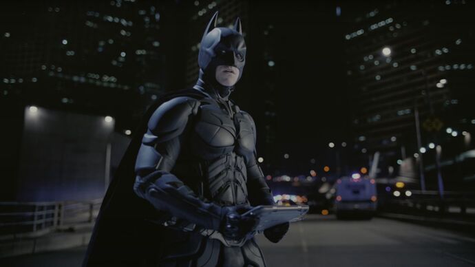
Christopher Nolan is no stranger to shuffling up the aspect ratios in his films, but it’s rarely done for symbolism. Instead, it’s because the director is an outspoken fan of IMAX and how it allows him to achieve the full scope of his themes and stories. IMAX is, of course, an entire aspect ratio unto itself (1.435:1) as it’s usually shot on 70mm film and meant for tall screens. Nolan incorporates IMAX into the standard 16:9 format for an otherworldly viewing experience. Nolan’s most famous use of IMAX is in The Dark Knight, which opens to the infamous Joker heist scene in full IMAX glory. Car chases and explosions are all filmed with IMAX to capture the full brunt of their power, and it was the same in Nolan’s final Batman film, The Dark Knight Rises (2012). Nolan’s upcoming biopic Oppenheimer will be the director’s sixth film to use IMAX, which is now a trademark for the auteur director.
6. The Incredibles (2004)
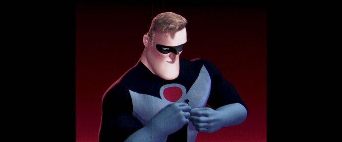
The Incredibles wasn’t the first movie to use a square aspect ratio to denote the past, but we just love this example! It proves that animation can also get clever with aspect ratios, as director Brad Bird showed us in 2004. The Incredibles opens to a reel of film stock as the superheroes prep for an interview, testing microphones and mumbling to themselves. After all, Pixar does love a good candid moment. It’s hard to say what year these interviews take place as the characters seem to live in a hybrid 1960s world with modern technology (read more about that crazy fan theory). But whenever it is, it’s 15 years before the Superhero Relocation Program bans spandex-wearing vigilantism. The “supers” talk about their experiences as heroes, joking about how they’re always having to clean up everybody’s problems. Man, does that come back to bite them…
5. Mommy (2014)
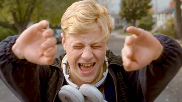
Mommy was so avant-garde that it wasn’t enough to film in a 4:3 aspect ratio—most of it was filmed in a perfect 1:1 square aspect ratio. A few dubbed the choice of 1:1 as pretentious, but director Xavier Dolan described it as a “humble and private format, a little more fitting to these lives we’re diving into.” The French-language film focuses on a hostile mother-and-son relationship in Canada, where the S-14 law allows parents to hospitalize their troublesome children. Freedom is a key theme in Dolan’s award-winning drama, perfectly exemplified by the aspect ratio change halfway through. Angsty teenage protagonist Steve (Antoine Olivier Pilon) literally pushes the square ratio out with his hands, creating physical space and liberation from his looming straitjacket.
4. Life of Pi (2012)
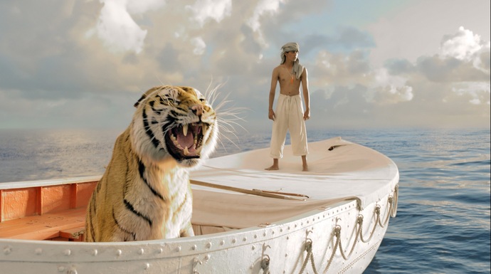
The majority of Life of Pi plays out in the wide format we’re used to. That said, you might spot the odd scene that strays from the norm. The most potent example is when fish start jumping out of the sea… and the screen! Their bodies fly over the black letterbox as if it’s a 3D movie minus the glasses, shot in 2.35:1 to relay the grandeur of the scene. Everything about this movie is expansive and immersive. It wants viewers to feel how huge, scary, and beautiful the ocean is to Pi (Suraj Sharma) when he’s left to fend for himself. The different aspect ratios are used to evoke various feelings, but they all feed back into this idea of vastness. Even when director Ang Lee employs a tight 4:3 ratio, it’s to put more focus on the top and bottom—the sky and sea—rather than the sides as he captures the huge whale beneath Pi’s boat. Life of Pi is as much a visual experience as it is a brilliant story, which Lee enhances through all the tools at his disposal.
3. Scott Pilgrim Vs. The World (2010)
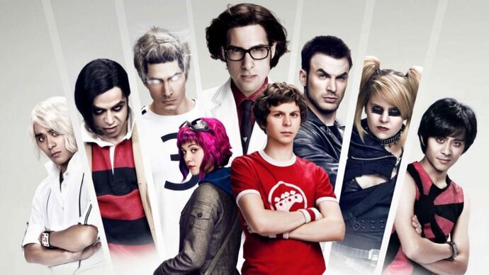
There’s a whole lot of special effects going on in Scott Pilgrim Vs. The World, and that’s not unusual given that it’s filmed in the style of a comic book—because it’s based on the comics by Bryan Lee O’Malley). The combination of live-action and animation make Scott Pilgrim Vs. The World one of the most fun, hilarious, and sensory experiences in cinema. But one of the special effects you probably won’t notice so much is its subtle-but-effective change in aspect ratios. Dynamic director Edgar Wright moves from standard widescreen to a much thinner 2.39:1 ratio to emphasize certain elements or themes. For example, when Scott (Michael Cera) enters “some idiotic dream,” the screen tightens to a more cinematic letterbox for added drama as he falls to his knees. All sorts of things happen on screen during the big showdowns, and the characters sometimes even punch over the black spaces.
2. Waves (2019)
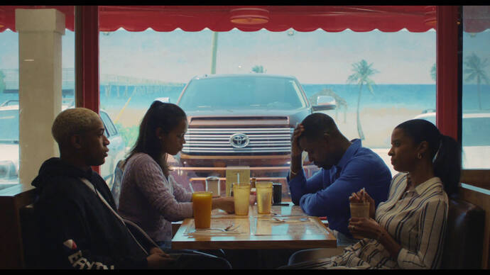
Trey Edward Shults directed Waves, a shapeshifting sports drama that evolved into something nobody expected. Tyler (Kelvin Harrison Jr.) is a competitive high-school wrestler whose father barely gives him room to breathe. As the pressure builds up, Shults gradually shrinks the 1.85:1 ratio down for a claustrophobic feel. Shults himself described this as “an expressive way to bring you closer”—a method that was also used in his earlier 2015 film Krisha. Here, it’s so important that the script itself specified this squeeze in screen space that keeps going until the climactic party scene. At that point, the movie could have plausibly ended, but instead it shifts to an entirely new story with Tyler’s sister Emily (Taylor Russell). Emily then has her own journey of ratio alterations, constructing a unique grammar to Waves that guaranteed its success.
1. The Grand Budapest Hotel (2014)
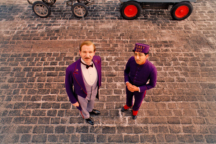
Wes Anderson is chiefly known for his distinct, satisfying cinematography. The auteur works alongside Robert Yeoman for all of his live-action movies, bringing us the poppy colors and precise symmetry we all love. The Grand Budapest Hotel doesn’t just employ Anderson’s standard visual tropes (e.g. still shots, bright matching colors, etc) but a fluid aspect ratio on top of all that. In fact, the film movies between three screen sizes, to be precise (because everything about Anderson is precise). In layman’s terms, Wes Anderson uses a different aspect ratio for each of the eras represented in the film:
The 1930s are shown in 1.37:1 The 1960s are shown in 2.40:1 The 1980s are shown in 1.85:1
Not only is it aesthetically pleasing to swap between these sizes non-chronologically, but it’s also practical for keeping track of the narrative!

